Volantis Design System
Client | Volantis Technology - AI Platform |
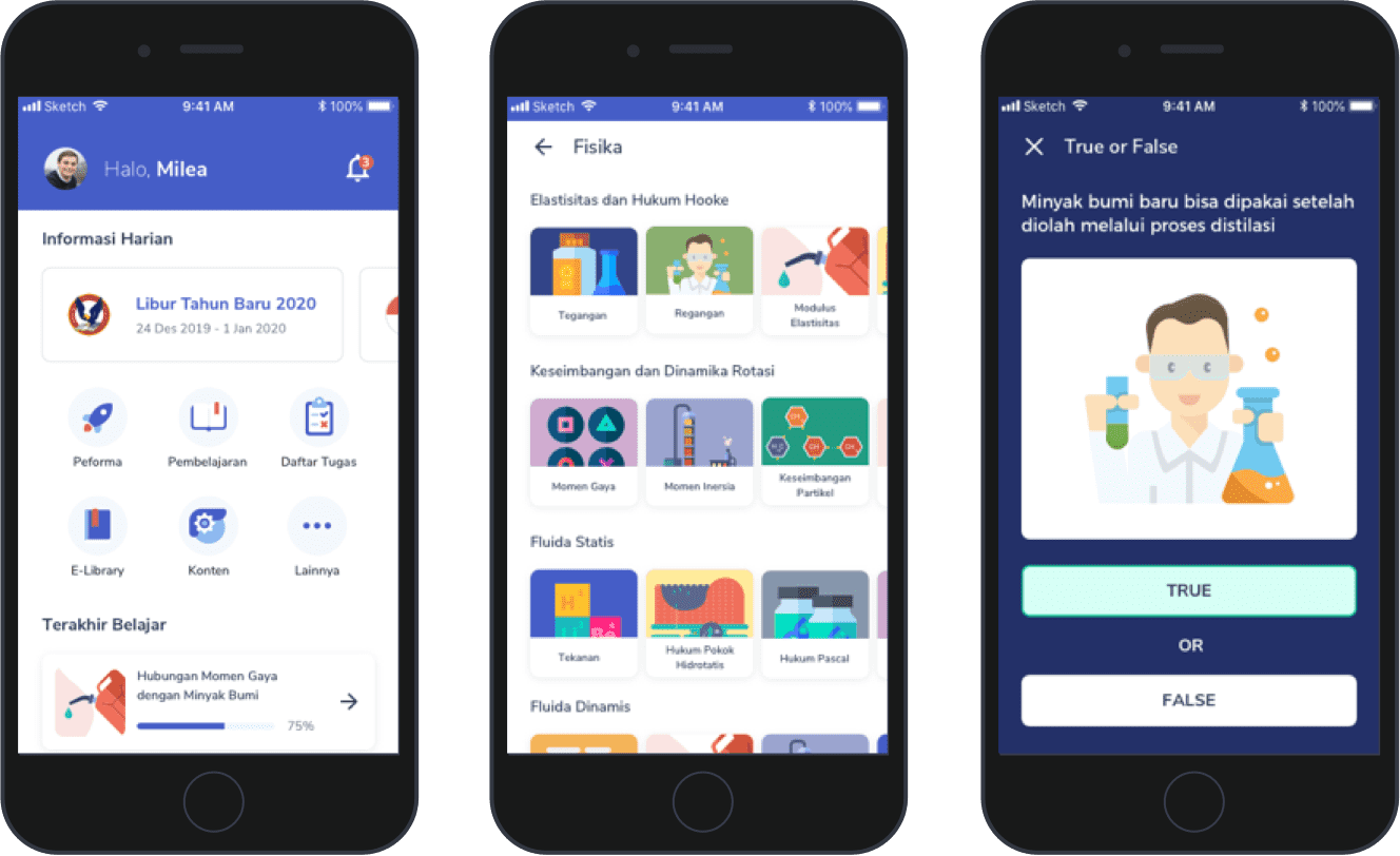
Overview | Volantis helps empower everyone in an organization to utilize the power of AI to solve complex business problems. Automate processes and predict the business's outcomes to help improve business performance. There were 2 UI/UX Designers, 9 Front-end Engineers, and 1 UI Engineer that develop and maintain some web apps. After some breaking chance and frictions happened between designers and engineers everyone start to realize the needs to fix the workflow and regulate everything. Otherwise, things will get messier and slower overtime. Even worse, everyone could burn out and unmotivated. It was designer's inisiative to refine the design language and create the guideline that would increase our design and development velocity, avoid reinventing the wheel, and improve the workflow between the design and engineer team. |
Outcome | After a couple weeks testing out the new workflow, we found some interesting results:
|
My Role | UI/UX Designer |
Tools | Sketch App, Abstract, Trello. |

Research
The Issues
There are several designers who work on different products, frequently re-creating components that have already been made by other designers.
Designers have difficulty making new components because they have to check all the designs that have been made (hundreds of artboard and sketch files) because there is no clear conventions or guidelines.
There were inconsistencies in the design language used on the landing page and the product's UI (due to the product release timeline, this issue still postponed). The difference is quite significant because it includes typography, color, and spacing.
Although the team have already used Abstract as versioning tool there is no clear standard procedure when there are additions or revisions to the design either it from the designer, engineer, or product owner. Because each work in a different product is often not communicated and documented.
Engineers often make their own decisions to use temporary design solutions that are always not communicated to other designers and engineers.
There are no official guidelines that can be used by designers and developers together to monitor updates and implementations in the UI Kit and production.
Assets handoff use various channels such as Slack, Email, Google Drive, and WhatsApp. This non-uniform communication causes problems around versioning, access sharing, and is difficult to validate.
User Interview
I did one-on-one interview sessions with 9 Front-end engineers, 1 UI engineer, and 1 UX/UI designer to uncover the root of the problems that occurred and discuss the tech constraint as well as the possible solutions. Discussed topics were about the daily routine, current workflow, design issues, and tools preference.
Insights
- No one mentioning or sounding whenever designer or engineer make an update.
- Untracked design status due to there is no convention about how we should document the design request, temporary design/solution logging, and design implementation status.
- There was no guidelines about how a layout/element should be handled in certain conditions (e.g. when the spacing should be fixed or fluid). For the most part just need a simple do’s and don’ts.
- Scattered assets delivery (Icon and illustration) as well as copywriting.
- Due to lack of product owner people, we have to create and manage features of certain products independently.
- Designers and engineers are not using same terms that sometimes cause misunderstanding (e.g color naming and typography scale naming).
- No one in charge to monitor the design status (both designer and engineer side).
Challenges
Getting everyone onboard
A Design System is not a one-man project and if you want it to succeed you need everyone on board. The more integrated you want it the more disciplines you need at the table.
Planning & Priority
Failing to plan is planning to fail. We constantly toggle between working on our Design System and enhancing the application and planning and prioritizing our tasks is imperative.
The Process
Laying The Foundation
Luckily, my fellow UI/UX designer already made some core/foundation components (using atomic design approach) that make me easier to contribute to the design system. However, merging multiple design languages from different products still tricky and painful works.
Grid
We use the 8pt grid system to space out the elements on a page. This means that any defined hight or width , margin or padding will be increment of 8. However, we still have some exceptions for certain needs.
Color
The dark mode approach used due to our brand identity is basically dark and yellow. Furthermore, the dark concept helps reduce eye strain while using some of Volantis’s condensed UI. Not to mention, it also helps the user to focus on content in our graphic-heavy such as data visualization app (Xplorer).
We use gray shade extensively for your container color needs. For primary color, we use Yellow #FFD77B (brand color). Various color accents needed to accommodate data visualization needs (think chart color).

Type Face
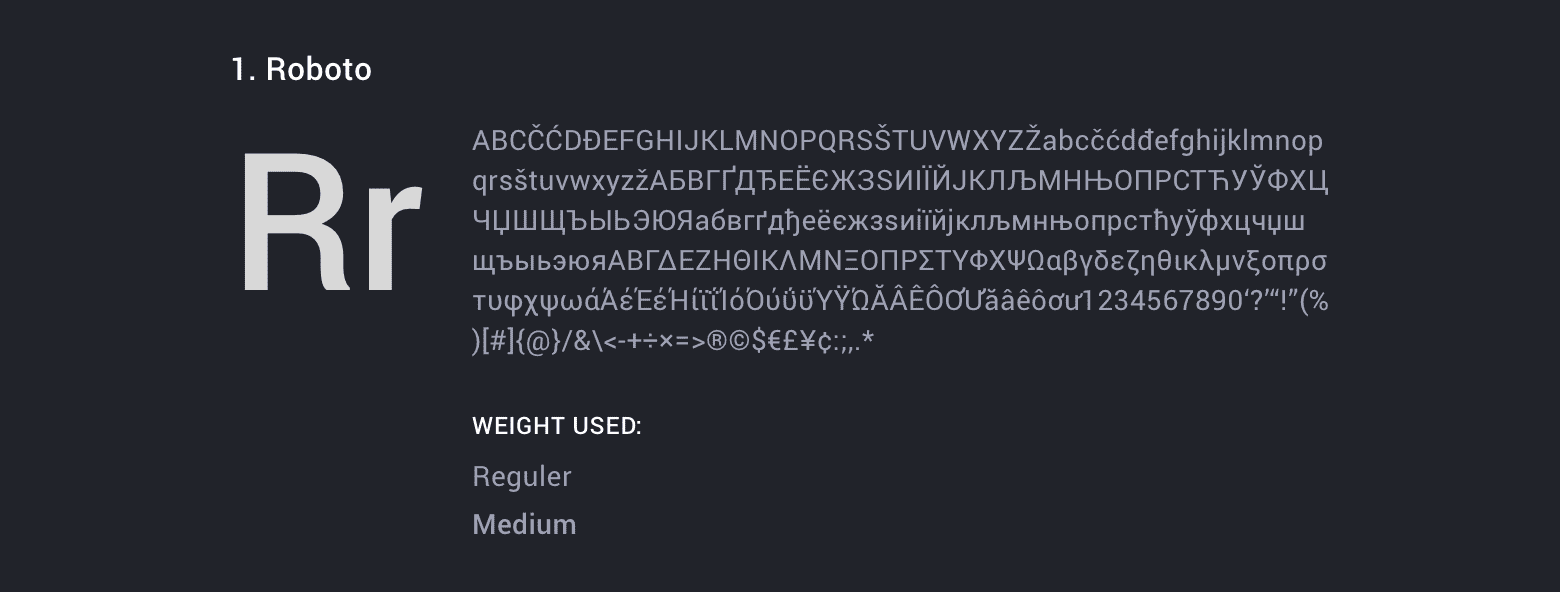
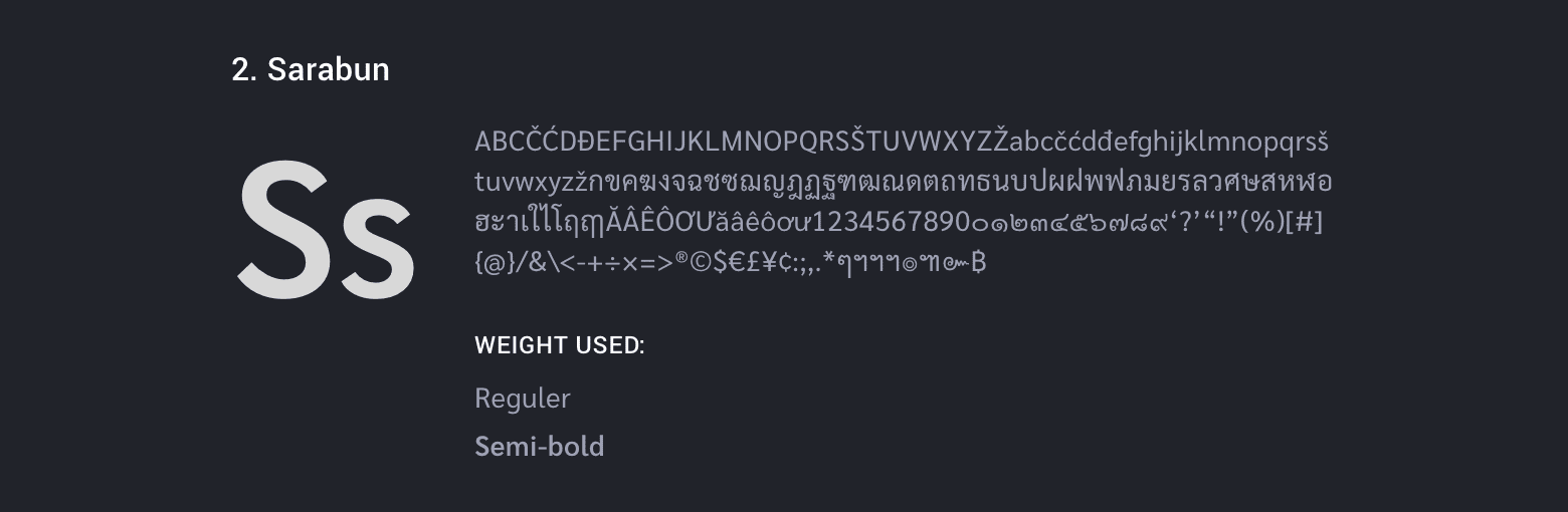
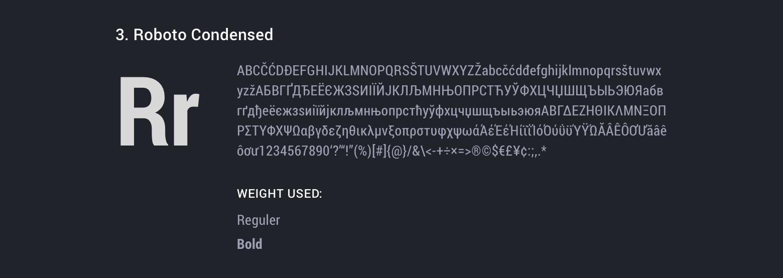
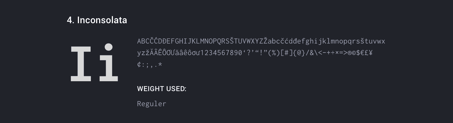
Roboto as the base Typeface across products, Roboto Condensed & Sarabun for landing pages, and Inconsolata for code snippet needs.
Icon
We use outline style with some exceptions to complicated forms that still need filled style. Our main Icon sizes are ranging from 18px, 24px, and 32px. There are some exceptions for special needs we use the smallest one which is 12px and the biggest one 36px.
Basically, we follow the Material Design icons principle with some exceptions in the name of optical alignment or certain special needs.
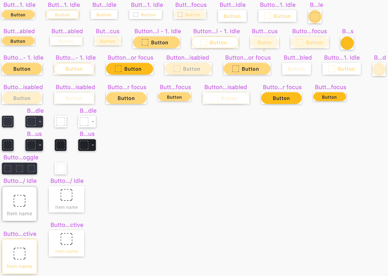
Button
Since we use buttons heavily in our UI we divided buttons into these categories:
- Choice button
- Transparent button
- Contained button
- Icon with Dropdown
- Icon button
- Outlined button
- Toggle
- Toolbar button
- Toolbar with Dropdown
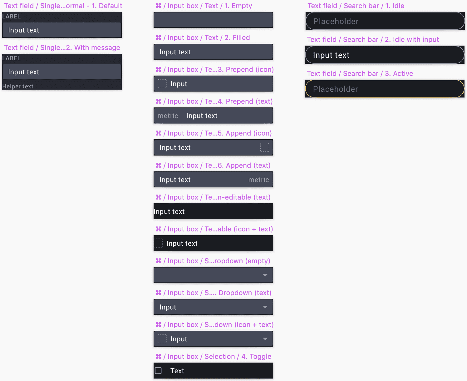
Input
Using same input elements and components provide unified language and consistent look throughout products.
Bringing it all together
Monitor Requests and Implenetations
In order to solve communication issues between Designers and Engineers I set up a Trello kanban to manage Icon and Component requests. Starting from request until implementation monitoring in production.
UI Engineer taking the charge as PIC to monitor and remind everyone to follow the procedure.

Conventions
Make agreements about naming colors, typography scale, and components (both in sketch and code form).
Single source of truth (Icons & Illustrations)
Store icons and illustrations in one repo (landing page design system) including version log and code snippet.
Best practice and exceptions
Devine do's and don'ts for commonly misused or ambiguous components.
Impact
After a couple weeks testing out the new workflow, we found some interesting results:
- No more breaking change whenever new design applied.
- No more random blaming.
- Able to spot someone who messes the workflow.
- Foster the sense of belonging.
- Better overall collaboration between designers and engineers.
- Bring everyone on the same page.
Afterwards, New landing concept was tested and had to be redesigned. Basically, it will be separated into 3 main segments which are marketing pages (logo, brand identity, etc), design pages (guidelines, files, etc), and component pages (ReactJS docs/snippet for engineers).
Project Learnings
Collaboration is key
The more eyes on a design, the more it’s exposed to varying opinions, experience, and critique — and this can only ultimately improve it. Or at the very least, test it.
Documentation in essential
No matter how rushed a project is, every decision and temporary solutions must be documented and announced trough the entire team.
Don’t be limited by existing blocks
Don’t force existing components to make an interface that ugly or has bad usability just for the shake of consistency. It is part of the design system development to add more components whenever it is needed.
Get the buy-in
Since this project is volunteer works, everything is often gets slowed down and postponed. Sometimes we have to block the schedule for example, ask for half day on Friday to evaluate design system would make things more manageable.