Gredu Design System Ver 0.1
Client | Gredu - EduTech |
Overview | Gredu is an EdTech Startup in Indonesia who provides all systems needed by schools from enrollment, literacy, school management system, and payment. Basically, there are 7 UI Designer and 1 UI/UX Designer (me) that handle more than 6 products that consist of Web Apps and Mobile Apps (Android & iOS). |
Outcome | Improved overall design quality, fasten the UI crafting phase while teaching juniors simustaneously, get the buy-in for future design system dedicated team. |
My Role | UI/UX Designer, Project Lead. |
Timeline | It took roughly 4 months for the this MVP which is cover scalable UI Kit and design guideline for 1 of our mobile app. |
Tools | Sketch App, Abstract, Jira, Trello, GatbsyJS+Netlify. |

Research
Understand the real problems
Observed how designer and engineer work, how they handle task right from they start designing up to deliver design handoff with its versioning.
I did some desk research how other companies at various level handle their design deliverables. I also did heuristic review to existing design.

Pain Points (Designer Perspectives)
- Inconsistency
- No guidelines
- Inefficient/slow execution time
- No single source of truth
- No accessibility test
- Poor handoff quality control
- No mentorship in the design team
Pain Points (Company Perspectives)
- Slow product cycle
- Unnecessary high development cost
- Ignorance culture across departments
- Poor user experience means bad brand reputation
Challenges
- Company’s UX maturity is quite low.
- Laid back culture that hesitant to make a high effort breakthrough move.
- Work on this project while still have to finish tasks from PM’s without special deadline adjustment.
- Each product has its distinguish personality that can not be unified into single style.
Set the blueprint for the unified design
After conducting some research about the scalable structure and what tools should be used I decided to go with Sketch App & Abstract as the design and collaboration tools. Here is the library chain in Abstract App.

With modularity in scalability in mind I come with several concepts and end up with this one.
Put every foundational element in separate files to make it easier to maintain. Using a unified style for all products.
Evaluate the structure using a dummy project
Unfortunately, the previous structure seems not working well since some product’s style can not be merged. For instance, teacher app which has the least feature using bigger type scale and bigger components size when student app has condensed components with smaller type scale.
Revised Version
These boxes represent a project in Abstract. Every single product uses the centralized foundation that covers:
- Typography
- Color
- Icons
- Illustration
Here is the revised library chain, using a single design foundation library that called by each product. This way, each product could have its adjusted style while maintaining the core or design foundation that keeps products in line with the company's design language.

Get The Buy-in
The hardest part is to get the buy-in from stakeholders
- Product Managers
- Chief Creative & Operation
- Chief Technology Officer
I got rejected couple times by the PMs because they don’t really understand the urgency. At this point, I have to work in silent for a while to make the prototype of my solutions.
Speak their languages
I managed to pitch in front of those stakeholders at our quarterly meetings. Eventually, after showing that benefits overcome the efforts in business perspective I got support from the board directors.
However, I still have to work on my daily tasks from PMs.
MVP
Start with a baby step
The team need a design system that sets the guideline for designers, engineers, and writers to work and collaborate faster yet produce high-quality deliverables.
However, it was way too big and unrealistic at that moment to start with all products at the same time

Start with one app with a scalable structure
I decided to start with the student app (iOS & Android) for the first MVP with a scalable foundation for the rest of the product line up.
Implement Design Foundation to Student App
As a starting point, I aimed to develop the foundation and refine existing student app components.
Design Foundation:
Layer styles, Icons, Illustrations, Typography
Student App Components:
App bars, Buttons, Chips, Dialogs, Selection Controls, Tabs, etc.

The Process
Speaking about design foundation, it's a must to understand the current language and what's works and what's not.
Collecting, curating, & taking notes
Probably, this is the most tedious part, we have dive into every single artboards to collect and sort current assets ranging from icons, illustrations, buttons, forms, type sizes, colors, etc.
Here are some examples of problem in UI perspective:
Icon
- Inconsistent style
- Not using bound
- Redundant icons
Color Palette
- Redundant color shades
- Color contrast not pass WCAG 2.0 standard
Illustration
- Not glued into brand identity
Typography
- There is no standard in type scale
- Contrast issue
Components
- Inconsistent style
- Accessibility issue
- There is no standard in pattern/behavior (e.g form states)
It's time to prepare the scalable sitemap for the deisgn system or guideline pages.
Here is the full version of what Design System page that company needs, obviously, it's not gonna be built in the first iteration.

Design System Portal Wireframe
This is the example of the design system portal once every single product guidelines are developed.

Focus on MVP
Since the goal at this release is focused on student app, I aimed to deliver UI Kit and design guidelines with scalability in mind.
Define the guidelines for cross-platform design
Ideally, each platform should get tailored design since they have their own interaction pattern. However, due to the lack of resources, the team decided to go with unified components that fit both Android and iOS app with minimum adjustment as possible.
Result
Components in nested symbols
Using nested symbol for every single component. With this structure, we just have to make the changes in foundations and respective components then the rest will be updated, this way everything will easier to maintain and make designers can focus on problem-solving and innovation rather than doing tiring repetitive works.

Refined Icons
Unified icon style, grouped into relevant categories, and defined icon specs.

Layer Styles
Divided into base, tint, container, and border layer style.

Refined Components Samples
Buttons
Created new naming system, button sizes, new type of buttons, and defined how and when to use each type.

Input Text
Provide every possible states of input text.

Structure samples

Before - After
Here are some comparisons between before and after the refinement.
Onboarding screen
Refined micro copy, button, contrast, and hierarchy.

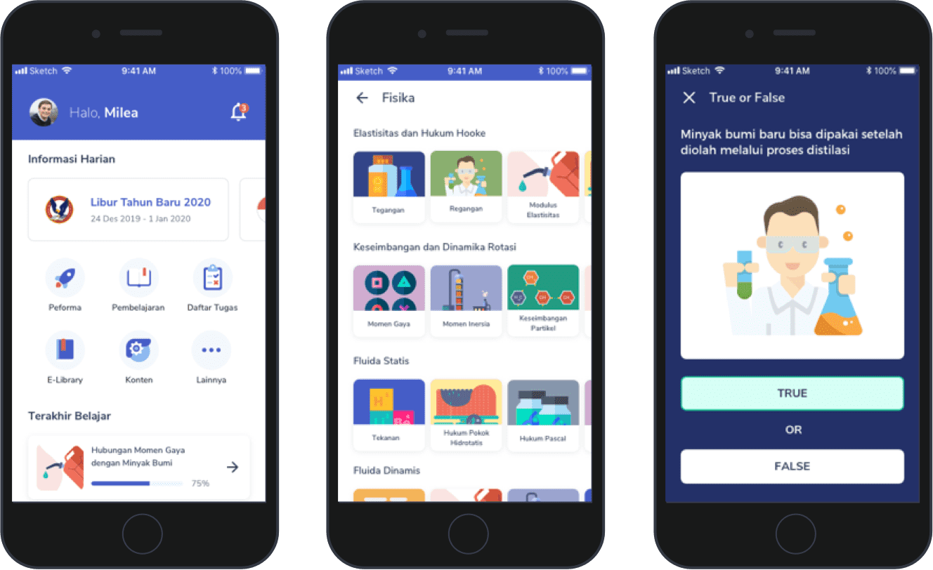
Student's performance screen
Simplified color context and overall accessibility.

Competency screen
Improved hierarchy, grouping, and colored text usage

Schedule screen
Improved hierarchy and overall accessibility

Calendar screen
Improved hierarchy and overall accessibility

Guidelines website for the student app
Since our engineers quite hectic at that time, I decided to code the website from scratch by myself. I created the static site using GatsbyJS and hosted it on Netlify.

Achievement Summary
- Created solid baseline for growing design system.
- Set guidelines and conventions (naming, sizes, spacings, etc.).
- Improved overall UI of the app (student app).
- Set new workflow and rules for design revision and handoff.
- Indirectly mentored juniors and nurture collaboration between cross departments.
- Fasten design process (high fidelity).
- Put designers and engineers on the same page (units, naming, versioning, etc.).
Project Learnings
- Show don’t tell, do the extra miles to getting stakeholder taste the benefits
- Speak their languages
- It’s always impossible until it’s done
- Have clarity in WHY