HRIS MarkPlus, Inc.
Client | MarkPlus, Inc. |
Overview | HRIS is the abbreviation of a human resource information system, in this case, it is a system that tailored for MarkPlus’s needs. Initially there was an prior system that used for years built by one of our vendor. Unfortunately, this system was a failure, it can be seen that the system didn't meet the company’s requirements and the majority of employees didn’t use it. Moreover, the experience was horrible which can be seen that employees complaining about it because it is hard to understand and not sure is it works or not, they tend to use back and fort email works instead. Not to mention, our HR was also having a hard time to introduce the system to the newcomer due to its poorly designed app. Finally, after years of the clutter of rules and track records our VP assigned HRIS redesign project to our team with some request about new features. |
Outcome | After the Beta testing revision is done, we fully migrate to the new system and some introduction sessions to our employees. We are excited to be pulling in data and using it to make more informed design decisions. The majority of employees now being actively checking the system to monitor their attendance performance, they are no more excuses to not make a leave request, according to the HR number of issues related to leaving and attendance drastically decreased, their job now getting easier. Eventually, due to some reasons, I didn't have the chance to gather qualitative results, because I was transferred to another project. However, this project was marked as a successful project by the stakeholders and even better, actively used by employees that previously refused to use the previous HR system. |
My Role | User research, Visual design, Prototyping, Front-end |
Tools | Adobe XD, HTML, CSS/SASS |

Research
The Brief
The existing system was hard to use and no longer able to accommodate our needs, at this moment, issues related to HR departments such as informal leave requests, allowance calculation, and attendance monitoring are getting worse. Stakeholder wanted to add some new features with flexible adjustments on the go.
User Research
Couple workshops and interviews were conducted with the stakeholders, IT officers, and employees. My research encompassed:
- Understanding the goals and pain points
- Validate current and new features
- Understand the technical constraints and data privacy policy
- Persona development
I conducted interviews with 13 employees from various divisions and job levels ranging from staff level until the director level. I stopped these interviews after the 13th person because I was not getting new findings. At that moment I didn't know that 5 participants are the golden number.
Insights
- Information architecture issues
- Nonstandard pattern/interaction
- Not mobile-friendly
- Existing generic software force the user to use unnecessary steps/features
- No reminder and notifications (by email or within the app)
- Can only be accessed using the office internet
- Loose application regulation
- There is no data disclosure so when there is an error the employee cannot show any evidence
User Profiles
The research made it evident how different users would use the app differently in certain features namely, leave and attendance. To cater to this, I categorized them into three user profiles based on their goals and tasks.
1. Manager
High mobility | prefer mobile app Uses Whatsapp, Spreadsheet, Gmail Task Performed: Request Leave, approve leave request, check personal attendance, monitor team’s attendance, report error data attendance.
2. Staff
Occationally travel around | prefer responsive web app Uses Whatsapp, Spreadsheet, Gmail, Instagram Task Performed: Request leave, check personal attendance, report error data attendance.
3. Manager
Mostly stay at the office | willing to use mobile and web app Uses Whatsapp, Spreadsheet, Gmail, Instagram Task Performed: Request leave, approve leave, check personal attendance, check employees’s attendance, update attendance data.
Competitive Analysis
I compared the most relevant HR platform out there whether it is web-based, mobile app, or both to take a good technique or approach that can be adopted and prevent making mistakes that have been overcome by similar products (Zenefits, Sleekr, Jojonomic).

Why web app & mobile app?
After conducting the research we realize that we have to develop a web app and mobile app to accommodate our user's diverse behavior. Some of them are quite active use the features while some only use it twice a month or so.
Furthermore, Due to delayed mobile developer hiring process and some other release urgency our team decided to develop the web app version first. Afterward, we were hoping after we release the web version we can get some insights for our mobile app version and the next iteration as a whole. In addition, I used the mobile-first design approach in these projects.
To make sure the way we structured this app is intuitive yet familiar (compared to the previous platform) I did grouping and sorting sessions with the HR team and some random employees.

Moving on, I explore some possible approaches using pen and papers before finally made up digital wireframes version to be get tested. I was using Axure RP back then. Here are some initial wireframes for the web app version I used to validate my concept within dev team and stakeholders.


Visual Exploration
After some iterations, I moved to the visual stage that covers color, typography, icon, and spacing. Since there are android and ios platform as well as a web app it is quite challenging to cater all the rules/guides. Not to mention, I have to avoid making drastic redesign from previous temporary web app solution.

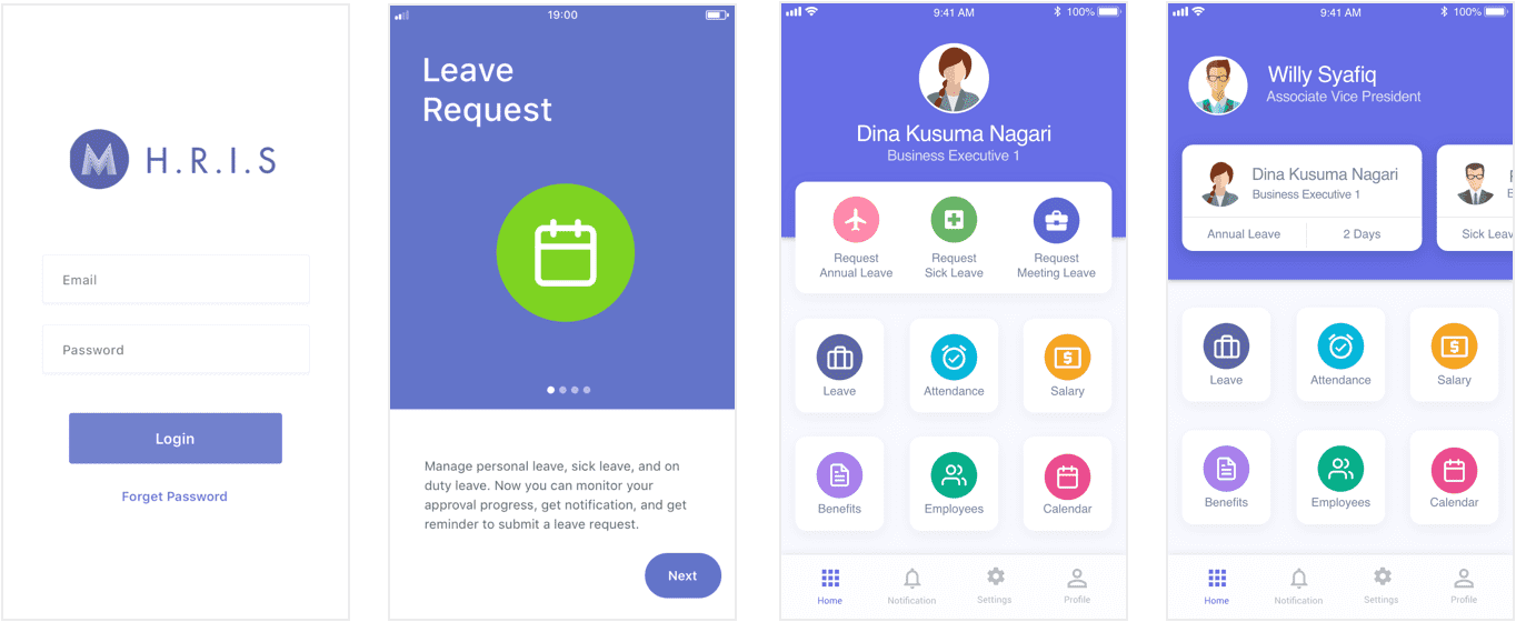
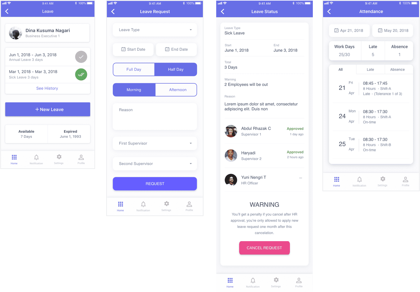
The Web App
Jump to the slicing process
As expected, there was tech constraints and some privacy issues that forced me to postponed or even worse throw some features. So after the revision was noted, in order to catch the timeline I did the revision in the form of HTML format so that our developer can start coding parallelly.

Noticeably, this time there are no single employees involved due to the timeline and limited support from authority issues. Therefore, we have to save our only chance to conduct proper usability testing with real users one time only. Our team decided to do that in production, with a hope that we will able to do the test case (developer side) parallel with the usability testing. Since I was the only one who took the design and front-end responsibility I did both works at a tight deadline. It was a bit frustrating to tackle everything once while learning new things at the same time. Sometimes some unexpected revisions regarding regulations within the flows happen in the development times.

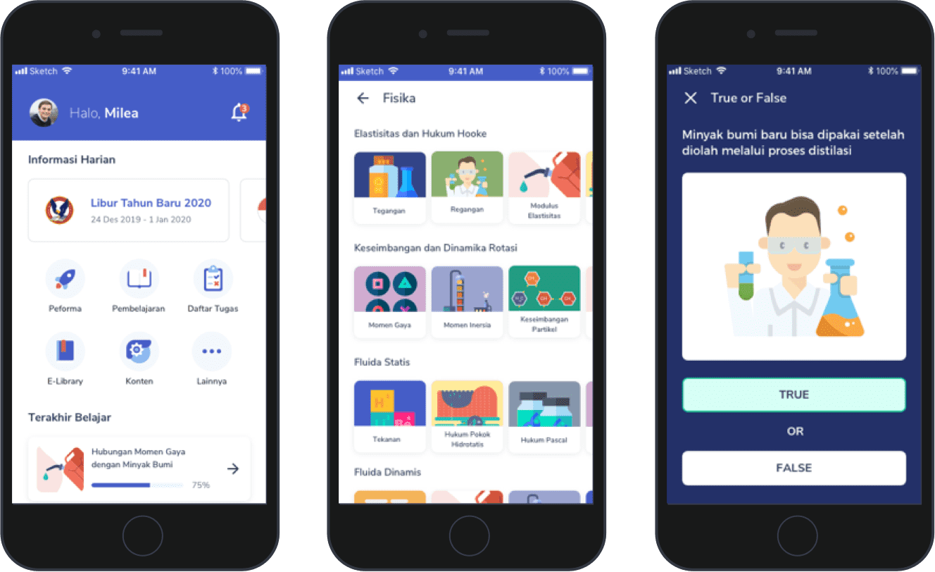
The Mobile App
The mobile app version has its own challenges but thankfully this time I was able to design the high fidelity with a decent timeline. I discovered some new improvements that can be done from the previous iteration and I have to consider both ios and android design language. The app was developed using React Native.
Furthermore, after some discussions with our graphic design team, I decided to update the look and feel a bit. I realized that this would cause design inconsistency within the redesigned timeline but we decided to go that way since the web version got some critics about its look and feel.
Validate
Usability Testing
Thankfully, That took 2 days only, those usability sessions are priceless to me, since those are the days that I’m able to successfully conducted the session with a lot of strategic level people involved by my self as a junior and self-taught designer (in a corporate company that resistant to design thinking approach).
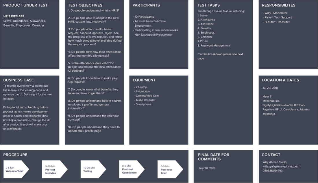
The result was surprisingly smoother than we thought, we only have to do some minor changes in visual matters such as color contrast, font size, button placements. Even further, participants were enthusiastic to give advice about a nice to have features to be considered for the next iteration. However, we have to admit that there were bugs here and there since this is an early beta-test as well.
Impact
The good and bad
After the Beta testing revision is done, we fully migrate to the new system and some introduction sessions to our employees. We are excited to be pulling in data and using it to make more informed design decisions.
The majority of employees now being actively checking the system to monitor their attendance performance, they are no more excuses to not make a leave request, according to the HR number of issues related to leaving and attendance drastically decreased, their job now getting easier.
Eventually, due to some reasons, I didn't have the chance to gather qualitative results, because I was transferred to another project. However, this project was marked as a successful project by the stakeholders and even better, actively used by employees that previously refused to use the previous HR system.
Project Learnings
1. Get the buy-in
As a designer, we have to get the buy-in from stakeholders and everyone on the team that involved, not getting everyone on the same page right from the start will cause some serious issues that will change the direction of the product and doing something useless or unnecessary.
2. Prioritize
Create a strategic plan to launch an MVP. This helps deal with out-of-scope requests that could potentially derail the project and help deliver a quality product in time.
3. Seek out for feedback as fast as possible
The trouble with most of us is that we would rather be ruined by praise than saved by criticism. Keeping the stakeholders/users in loop and testing solutions in whatever form (paper, low-fi or hi-fi) as early as possible saves ample amount of time and re-work.
4. Design handoff
Since this is my first time lead a big revamp project that implements design thinking and deal with UX processes while learning it on the go everything fell rushed and I have to admit that my handoff to our fellow developers was not that good, that time I didn't know about something like Zeplin. That caused guessing games that ruin the padding size, color, font-size, etc.